Katkin, an example of effective branding.
I’d like to talk about an example of effective branding.
I’ve decided to give our “junior graphic designer”, Ginge Michael better quality food, after thorough research, I’ve chosen Katkin, a new British fresh cat food brand.
Ginge Michael is just day 5 into the food, it’s too early to say whether the food is good for him or not. So this is certainly not a “product placement” for Katkin lol.
Surprisingly I really love their branding and graphic design, why?
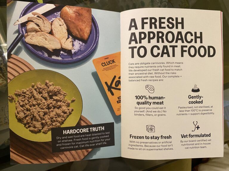
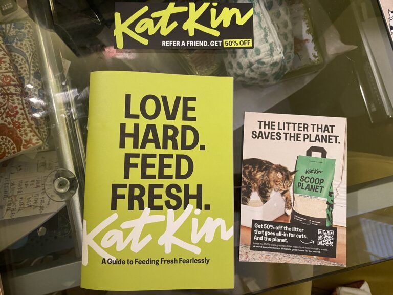
1. I love the fact that there was a small, beautifully designed booklet included within the parcel as feeding guidance to the new customers.
2. Their colour palette contains around 7 colours. The designer/agency used the colours very gracefully, so the whole branding is tidy and refreshing.
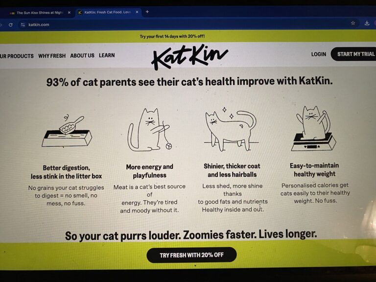
3. There is plenty of white space across the booklet and website, and colour blocks are smartly used to separate content. So the layouts are very simple, trendy and easy to read.
4. Simple illustrations are widely used across the booklet and website. Which added more creativity and features to the branding, and delivered a clear and instant message!
In conclusion, from a designer and branding strategist’s point of view, personally, I’m very impressed with the branding of Katkin. I think they tick all the boxes. And my favorite feature is their beautiful and simple illustrations.
If you are looking for branding or rebranding, illustrations or infographics, I can definitely help, please contact me at contact@monaking.co.uk.
Please feel welcome to share your thoughts in the comments.